TOKYO has won the battle to host the Olympic Games in 2020 after beating rivals Madrid and Istanbul.
The Japanese capital was named as host by the International Olympic Committee (IOC) meeting in Buenos Aires this evening.
It was heartbreak for Spanish sports fans as Madrid, who had failed in its bids to host the last two Olympic Games, was knocked out in the first round of voting. This left Tokyo and Istanbul in the final head-to-head.
Both Tokyo and Madrid pledged to spend a fraction of the cost of the London 2012 Games.
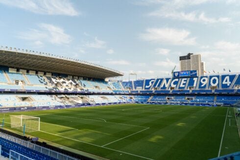
Madrid 2020 boasted 80% of its venues are already in place and a construction budget of just £1.3bn – London’s comparable cost was £9bn.
Click here to read more News from The Olive Press.


Tokyo clearly was always the favorite.
I guess the world knows Spain is bankrupt, and the northern European countries would be the ones bankrolling this for Madrid. All the corruption scandals don’t help either.
The Spanish logo has “20020” lol.
Well spotted Fred. Not a chance before then then
er, it was for their pitch Fred duh
I bet you rejoice in the fact Spain lost out on this one. It has some great stadiums too. This would have lifted the country slightly.
Madrid’s 2020 Olympics bid failed because of Spain’s international damaged brand of political and banking corruption. The rain in Spain falls … .. is what everybody internationally is singing about Spain. Sending a Royal to boast the confidences of an Olympic bid has expired its used by date. Every country that has undergone serious banking reforms, it has lead to a stronger economy for that nation and for international bodies to support their bids to host major events. Spain has to fix its self internally before expecting an international body to support any bid they present. Chop Chop Spain fix your mess!!!!!
“The design purportedly consists of the letter M for Madrid and the number 20 in front of the coloured rings of the Olympics stylised into arches inspired by the Madrid landmark, Puerta de Alcalá.” The logo was designed by Luis Peiret, 22, a graphic arts student from Zaragoza and chosen in a competition by the Spanish Olympic Committee. Reports said he had intended the script to say M20 but when officials modified the logo they trimmed the bottom of the design leading to the visual confusion. Bizarrely even the colours used to represent the Olympic Rings were not faithful to the original with pink being chosen to replace black, the colour meant to symbolise the African continent.
Spaniards should heave a huge sigh of relief, Olympic games rarely prove economically beneficial. With the state of it’s economy it simply cannot afford such luxuries.
Calm down Trevor, I’m not rejoicing but merely pointing out that the branding is very confusing and its poor design must have been a factor in the rejection. The orginal logo is even worse imho, just look at both side-by-side:
Spain had not been so greedy
Olympic Games would not have been out of the continent now
You’re so easy to catch predictably tedious Fred. A thousand people are always ‘loling’!
No idea what you’re talking about Trevor. Best take a rest.
Fred’s contributions are far more interesting than yours Trevor. If you’re looking for humour try the Beano LOL